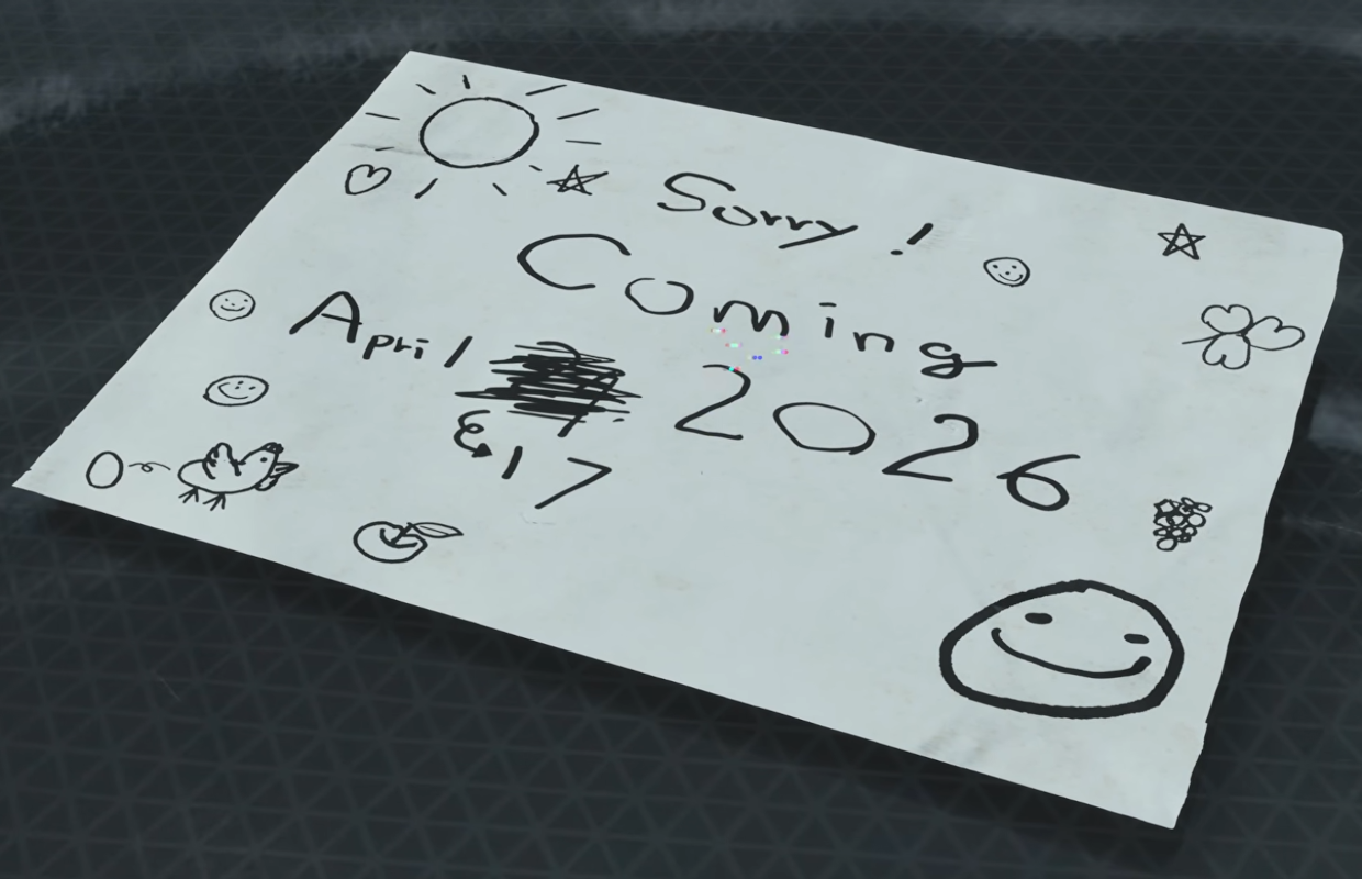
Pragmata release date is moved forward a week to April 17
It seems the release date change isn’t happening everywhere. The Japanese Capcom Spotlight showed only the PlayStation 5, Xbox Series X, and PC versions being moved to April 17th. Surprisingly, the Nintendo Switch version in Japan will still be released on April 24th.