Author: Denis Avetisyan
A new mobile application translates complex artificial intelligence predictions into clear, user-friendly explanations of individual diabetes risk.
This research details the design and implementation of a mobile front-end for presenting explainable AI results, utilizing SHAP values and large language models to enhance data visualization and user understanding of diabetes risk prediction.
Despite advances in artificial intelligence for healthcare, the “black box” nature of many predictive models hinders user trust and actionable insights. This is addressed in ‘A Mobile Application Front-End for Presenting Explainable AI Results in Diabetes Risk Estimation’, which details the development of a mobile application designed to translate complex, AI-driven diabetes risk predictions into readily understandable information. By leveraging SHAP values and integrating them with intuitive visualizations-bar and pie charts-and personalized narratives generated by a large language model, the application demonstrably enhances user comprehension of individual risk factors. Could this approach pave the way for more effective preventative healthcare interventions and greater patient engagement with AI-powered diagnostics?
The Escalating Crisis and the Need for Transparent Systems
Indonesia currently faces a rapidly escalating diabetes epidemic, presenting a significant and growing challenge to public health infrastructure and individual wellbeing. The prevalence of this chronic disease has surged in recent decades, driven by factors including lifestyle changes, dietary shifts, and a growing aging population. This increase places immense strain on the nation’s healthcare system, demanding innovative and effective management solutions beyond traditional approaches. Without proactive intervention, the economic burden associated with diabetes – encompassing treatment costs, lost productivity, and disability – is projected to rise dramatically, underscoring the urgent need for scalable, accessible, and preventative strategies to curb the spread and mitigate the impact of this pervasive health crisis.
Many contemporary applications designed to assist in diabetes management, such as DiabTrend, function as largely opaque systems, delivering predictions without revealing the underlying reasoning. This characteristic – often referred to as the ‘black box’ problem – presents a significant obstacle to both clinical acceptance and patient adherence. Healthcare professionals are understandably hesitant to rely on recommendations they cannot scrutinize or understand, particularly when impacting patient health. Similarly, individuals living with diabetes may be less likely to follow advice if the basis for that advice remains unclear, hindering effective self-management and potentially eroding trust in the technology itself. The inability to discern why an application suggests a particular course of action limits its utility beyond simple data presentation and highlights the crucial need for greater transparency in AI-driven healthcare solutions.
The limited transparency of current artificial intelligence systems in diabetes care presents a significant obstacle to widespread clinical integration and patient participation. When AI predictions remain opaque – functioning as an uninterpretable ‘black box’ – healthcare professionals are often hesitant to fully rely on the insights generated, hindering its practical application in patient management. This lack of understanding extends to patients themselves, diminishing their ability to actively engage with their care plans and make informed decisions about their health. Consequently, the development of interpretable AI – systems that can clearly articulate the reasoning behind their predictions – is crucial to fostering trust, empowering both clinicians and patients, and ultimately improving the effectiveness of diabetes management strategies.
The future of diabetes management hinges on a transition towards Explainable AI (XAI), a methodology designed to illuminate the reasoning behind algorithmic predictions. Rather than functioning as opaque ‘black boxes’, XAI systems reveal the key factors influencing their assessments of a patient’s condition and projected health trajectory. This transparency is crucial for fostering trust among clinicians, who require understanding to confidently integrate AI insights into their practice, and for empowering patients to actively participate in their own care. By detailing why a particular recommendation is made – identifying relevant biomarkers, lifestyle factors, or medication responses – XAI facilitates informed decision-making, moving beyond simple acceptance of an algorithm’s output. Ultimately, this shift promises not just improved clinical outcomes, but a more collaborative and patient-centered approach to managing this growing public health challenge.
Deconstructing Complexity: XAI Methods in Practice
Explainable Artificial Intelligence (XAI) techniques, such as SHAP (SHapley Additive exPlanations) and LIME (Local Interpretable Model-agnostic Explanations), address the challenge of understanding complex machine learning predictions by decomposing them into feature contributions. SHAP utilizes concepts from game theory to assign each feature a value representing its impact on the prediction, considering all possible feature combinations. LIME, conversely, approximates the complex model locally with a simpler, interpretable model – typically a linear model – around a specific prediction instance. Both methods quantify the extent to which each feature’s value contributes positively or negatively to the model’s output for that particular instance, allowing for the identification of the most influential features in driving the prediction.
XAI methods such as SHAP and LIME generate local explanations by assessing feature contributions on a per-prediction basis. Rather than providing a global understanding of the model, these techniques decompose each individual output to determine which input features most strongly influenced the result. This is achieved by perturbing the input data and observing the corresponding changes in the model’s prediction; features causing significant shifts are identified as key drivers. Consequently, the explanation provided is specific to the instance being analyzed, highlighting the features responsible for that particular outcome and allowing for focused interpretability of the model’s behavior in specific cases.
The outputs generated by Explainable AI (XAI) methods, such as feature importance scores or decomposition values, are often presented as numerical data or complex feature interactions. While technically accurate, these raw outputs frequently lack immediate clarity for individuals without specialized knowledge in machine learning or data science. Consequently, effective visualization techniques are essential to translate these technical results into formats that are readily understandable and actionable for a broader audience, including stakeholders, domain experts, and end-users. These visualizations can include feature importance plots, decision trees, or heatmaps, all designed to convey the relative influence of different features on a given prediction in a visually intuitive manner.
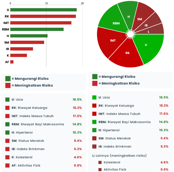
Data visualization techniques are essential for communicating the outputs of Explainable AI (XAI) methods to a broader audience. While tools like SHAP and LIME generate numerical feature importance scores or identify influential data points, these raw outputs lack immediate interpretability for stakeholders without a strong technical background. Visualization, encompassing techniques such as bar charts displaying feature contributions, decision plots illustrating prediction pathways, and heatmaps highlighting feature interactions, transforms these complex values into readily understandable graphical representations. This translation is critical for fostering trust in AI systems, enabling informed decision-making, and facilitating effective communication of model behavior to both technical and non-technical audiences.
Simplifying Insights: Optimizing Visual Clarity
Waterfall Plots and Force Plots, despite their capacity to display intricate relationships within data, present significant cognitive load for users lacking expertise in Explainable AI (XAI). These visualizations often require pre-existing knowledge of the underlying algorithms and data structures to be effectively interpreted. The complexity arises from the multiple visual elements and their interactions, demanding considerable mental effort for decoding the information. Studies indicate that users unfamiliar with XAI principles experience difficulty identifying key drivers and understanding the relative importance of different features when presented with these complex visual representations, leading to reduced comprehension and potential misinterpretation of the results.
User preference for visualization simplicity varies based on analytical background. Studies indicate Bar Charts are favored by participants with experience in structured data analysis due to their direct representation of magnitude and ease of comparison. Conversely, individuals without such backgrounds often prioritize the aesthetic appeal and proportional representation offered by Pie Charts. Diverging Bar Charts also provide a clear method for highlighting positive and negative contributions, though user preference for this format was not as strongly correlated with background as observed with Bar and Pie Charts. This suggests that while analytical expertise drives a preference for precise data representation, general users may prioritize visual clarity and intuitive understanding when interpreting XAI results.
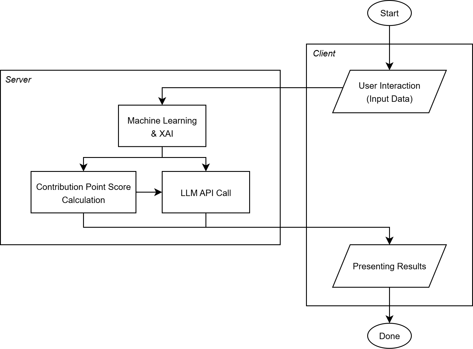
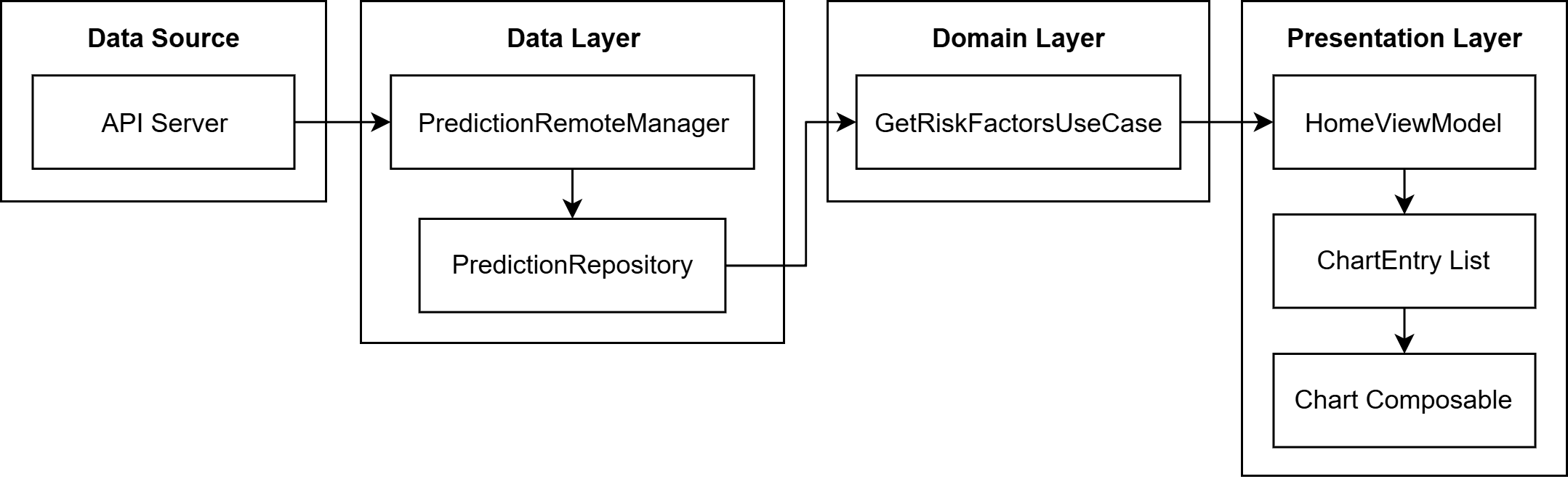
The Android application utilizes MPAndroidChart, a powerful cross-platform charting library, in conjunction with the Kotlin programming language and the Android Studio integrated development environment to render XAI visualizations. MPAndroidChart provides a range of chart types and customization options suitable for displaying complex data in an accessible manner on mobile devices. Kotlin was selected for its conciseness, safety features, and interoperability with Java, facilitating efficient development and maintenance of the application. Android Studio offers a comprehensive suite of tools for building, testing, and debugging Android applications, ensuring a streamlined development process and optimal performance of the visualizations on target devices.
Integration of Large Language Models, specifically GPT-4o, serves to improve the accessibility of Explainable AI (XAI) results by generating natural language explanations that accompany visual representations. This multimodal approach – combining visualizations with textual descriptions – has demonstrated a high level of user comprehension, achieving an average score of 4.31 out of 5 in user testing. The LLM’s role is to translate the data presented in the visualizations into easily understandable language, thereby reducing the cognitive load on users and facilitating broader adoption of XAI technologies, regardless of their technical expertise or background in data analysis.
Beyond Explanation: Ensuring Reliability and Trust
The foundation of any successful diabetes management application lies in its functional reliability, as consistent and predictable performance is paramount to establishing user trust. A system that frequently malfunctions or delivers inconsistent data erodes confidence, potentially leading patients to disregard critical insights and clinicians to question its recommendations. This isn’t simply about avoiding errors; it’s about building a sense of security and dependability, assuring users that the application will consistently deliver accurate information and support informed decision-making. Without this underlying reliability, even the most sophisticated algorithms and insightful explanations will be met with skepticism, hindering the application’s effectiveness and ultimately impacting patient care.
To ensure consistently dependable performance, the diabetes management application utilizes Espresso, a framework for automating end-to-end testing. This rigorous process simulates real user interactions, verifying that all application features function as designed across a comprehensive suite of scenarios. Currently, the system maintains a 100% functional test pass rate, achieved through the execution of 111 distinct automated tests. This level of scrutiny isn’t merely about bug detection; it’s a commitment to delivering a stable and predictable user experience, crucial for building confidence in a tool designed to support critical healthcare decisions and promote proactive diabetes management.
User comprehension hinges significantly on the stability and dependability of the system providing information; a consistently reliable application fosters trust, making individuals more receptive to its explanations. When a diabetes management tool functions as expected, users are better equipped to process and understand the insights presented, rather than questioning the validity of the information due to perceived errors or instability. This connection between reliability and understanding is critical, as inaccurate or inconsistent outputs erode confidence and hinder effective self-management. Consequently, prioritizing a robust and thoroughly tested system directly enhances a user’s ability to interpret and act upon the provided data, ultimately leading to improved health outcomes and informed decision-making.
The convergence of explainability and reliability is fundamentally reshaping diabetes care by fostering informed decision-making amongst both patients and clinicians. A system that not only provides insights but also demonstrates consistent and trustworthy performance cultivates a higher degree of confidence in its recommendations. This synergistic approach moves beyond simply presenting data; it establishes a foundation of trust, enabling individuals to actively participate in their care and make well-considered choices. Ultimately, prioritizing these qualities isn’t merely about technological advancement; it’s about empowering those managing diabetes with the tools and confidence needed to achieve better health outcomes and a more sustainable approach to well-being.
The application, as described, attempts to distill intricate algorithmic outputs-specifically, SHAP values derived from Explainable AI models-into accessible insights. This pursuit of clarity echoes a fundamental principle: to move from complexity to understanding. As Blaise Pascal observed, “The last thing one kills in a person is their sense of wonder.” The design prioritizes not merely presenting data, but fostering comprehension, allowing individuals to engage with their diabetes risk assessment not as a foreign calculation, but as meaningful, personal information. The elegance lies in subtraction-removing layers of technical jargon to reveal the core message and empower informed decision-making.
Where to Next?
The presented application, while a functional demonstration, illuminates a predictable truth: translating algorithmic output into human understanding is rarely a matter of adding complexity. Rather, it demands ruthless subtraction. The current iteration succeeds by presenting simplified visualizations and natural language explanations of diabetes risk, but it skirts the harder question: what information is truly necessary for informed action? Future work must prioritize not just clarity of presentation, but the minimization of presented data – a constant pruning of perceived relevance.
A further limitation lies in the reliance on SHAP values as the sole conduit for explanation. While demonstrably useful, this approach inherently frames understanding through the lens of feature importance – a potentially misleading simplification. The field would benefit from explorations of counterfactual explanations, or even methods that explicitly highlight the limits of the model’s predictive power. Acknowledging what the algorithm doesn’t know may prove more valuable than detailing what it does.
Ultimately, the true test lies not in building more elaborate interfaces, but in measuring demonstrable behavioral change. Does increased understanding, delivered via such an application, genuinely improve preventative health outcomes? Until that question is answered, the proliferation of explainable AI remains a fascinating, but ultimately self-serving, exercise.
Original article: https://arxiv.org/pdf/2601.15292.pdf
Contact the author: https://www.linkedin.com/in/avetisyan/
See also:
- Off Campus Season 1 Soundtrack Guide
- Chainsaw Man Volume 24’s Cover Art Reveals a Brand-New Denji
- X-Men ’97 Finally Gave Gambit the Hero Moment He Deserved
- 46 Years Later, The Mandalorian & Grogu Answers A Major Empire Strikes Back Question
- HoI4 fans harsh reactions to the announcement of another DLC pack
- 10 Worst End-Game Couples In Sitcom History
- Emily Henry Says to ‘Trust the Vision’ For Beach Read Adaptation
- DoorDash responds after customer uses AI to make food look bad and get a refund
- Hatsune Miku cosplayer goes viral selling $15 cups of “foot juice” to thirsty anime fans
- Gold Rate Forecast
2026-01-23 21:05