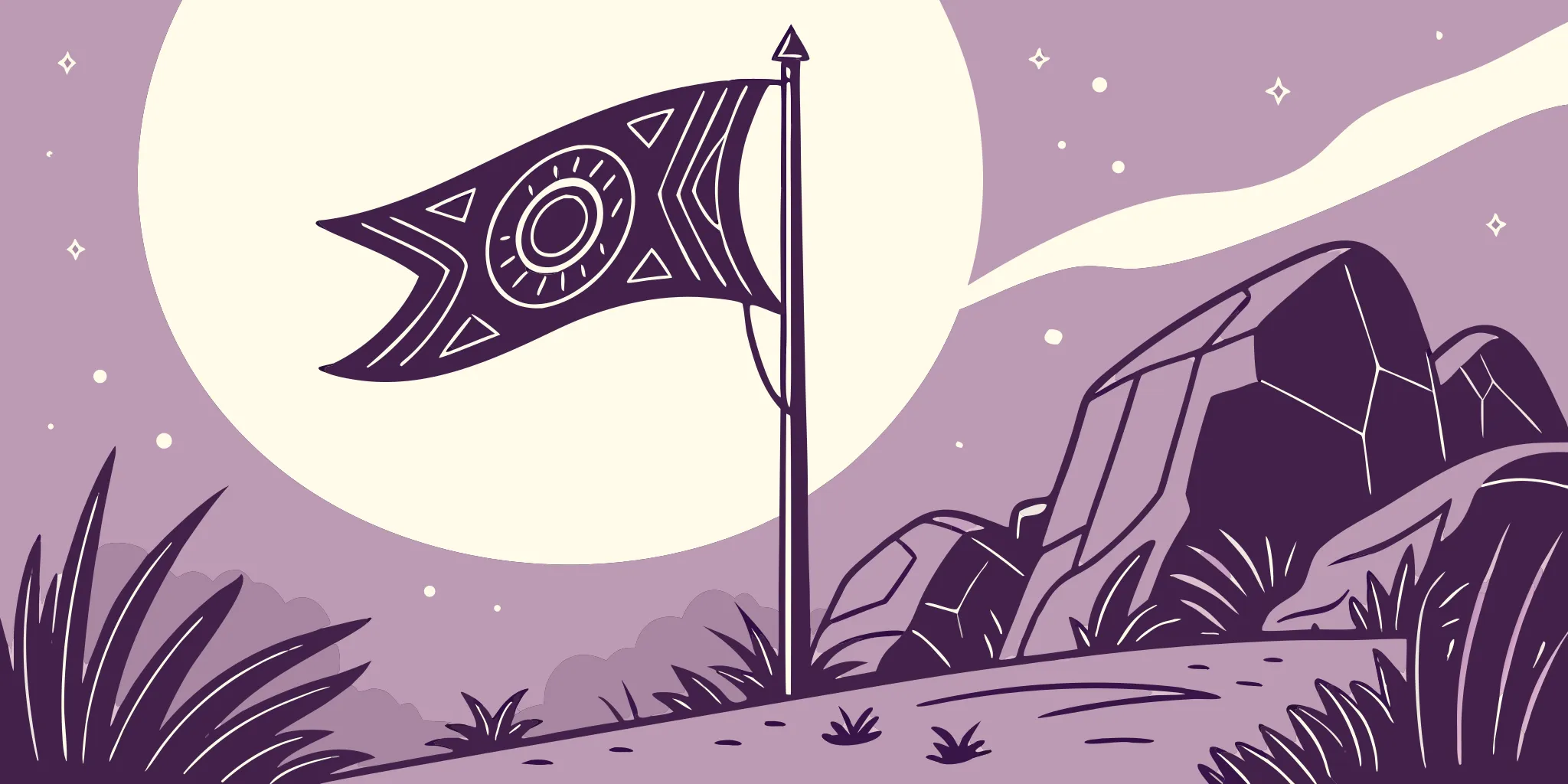
In most fictional evil empires, you immediately know who the villains are – their flags are full of threatening colors and symbols. But Super Earth is different. Its flag is clean, patriotic, and surprisingly peaceful, using calming blues and a simple white emblem. It looks more like a logo for a friendly technology company than the symbol of a powerful military force. This is what makes it so effective and unsettling. Instead of trying to frighten people, the flag aims to inspire them. It’s a cleverly designed piece of propaganda that goes against typical dystopian imagery, making it one of the most impactful flags in video games.
Key Takeaways
- Color choices are intentional propaganda: Super Earth’s flag uses a calming blue and pure white to project an image of trust and stability, making its violent expansion feel like a noble cause worth fighting for.
- The flag’s design hides violence in plain sight: By using clean, corporate-style symbols of peace and order, the flag distances itself from the brutal reality of galactic warfare, effectively rebranding imperialism as “liberation.”
- It’s a “good guy” flag for a bad guy regime: The design intentionally avoids aggressive visuals common in dystopian fiction. Instead, it looks trustworthy and heroic, which is the core of the game’s satire—it makes you want to fight for a cause you should probably be questioning.
Why is Super Earth’s Flag Blue?
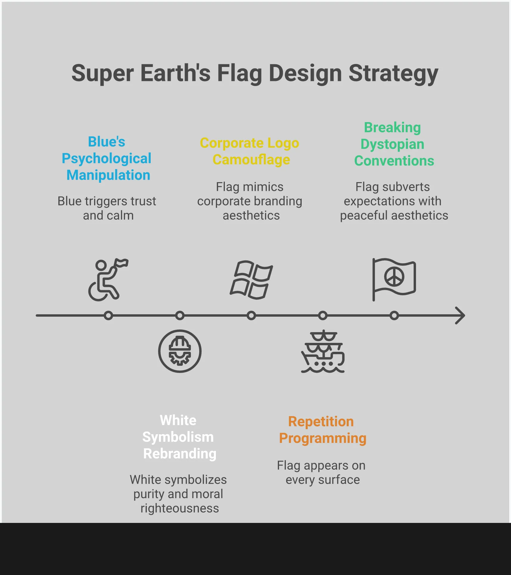
Okay, so I’ve been thinking about the Super Earth flag, and it’s kinda messed up. That blue isn’t just there – it’s totally intentional. They picked that specific shade to make us feel good about what we’re doing, even though what we’re really doing is pushing their version of ‘democracy’ on everyone. It’s sneaky! While I’m out here fighting for freedom, that flag is working on my brain, making Super Earth seem stable and like the ‘good guys’. Honestly, the whole look of Super Earth is designed to mess with your head, but that blue? It’s doing most of the work. It’s calm and reassuring in a chaotic universe, and that’s why it’s so effective… and kinda creepy when you think about it.
Blue: The Color of Trust and Peace
Blue is often linked to feelings of trust and security. We naturally connect it with peaceful things like clear skies and calm oceans. The governing body of Super Earth understands this connection and uses it to its advantage. By consistently using blue, they create an image of a trustworthy and caring government, even if they haven’t truly earned that trust. This makes it easier for people to support their goals, as the color itself feels comforting and reliable.
Using Color to Create Calm
Blue is frequently used in corporate branding and healthcare because it naturally helps people feel calm. Studies show it can even lower heart rates and create a sense of peace. This is especially important for a government sending citizens into dangerous combat situations. The blue in the national flag serves as a comforting symbol, reminding people of the stability they are defending. It helps maintain public cooperation and keeps soldiers, like the Helldivers, focused and reassured even when facing intense threats.
How Blue Inspires Loyalty
We naturally become loyal to things we trust. For years, banks and tech companies have used this to their advantage, often featuring the color blue in their branding. Now, Super Earth is doing the same thing. By choosing a color widely associated with dependability, the government aims to project an image of stability in a chaotic galaxy. This established link between blue and trustworthiness fosters strong loyalty among citizens, making them feel connected and willing to fiercely defend their community.
What Do the Symbols on Super Earth’s Flag Mean?
The Super Earth flag isn’t just visually appealing; its central emblem is a carefully designed symbol with a powerful message. The colors white and yellow, combined with the emblem’s balanced design, suggest a strong and positive government bringing hope to the galaxy. However, there’s a deeper meaning behind each element. Let’s take a closer look at what the flag is truly communicating.
White: A Symbol of Purity and Order
The heavy use of white in Super Earth’s symbol is deliberate. White commonly represents peace, innocence, and cleanliness, and Super Earth uses this to present its expansion across the galaxy as a virtuous undertaking. According to the established story, the white emblem signifies Super Earth’s goal of bringing order and harmony—and peace—to all planets. It’s meant to visually assure others that their arrival is positive, a force for good in a turbulent universe. This creates an image of a morally upright government whose actions are justified, effectively concealing the violent truth behind their “liberation” efforts with a symbol of righteousness.
The Importance of Symbol Placement and Balance
The emblem isn’t a simple design; every part of it was carefully planned and organized. Its symmetrical, gear-like shape suggests accuracy and strength, mirroring the idea of a controlled society. At the heart of the emblem is Super Earth, and observant fans have noted that the capital city, Prosperity City, is positioned at the very center. This isn’t just about location; it’s a clear message that Super Earth is the core of civilization and that all advancement and control originate from there.
Yellow Accents: A Glimmer of Hope
The small touches of yellow in the flag aren’t just there to look nice. While blue conveys peace and white suggests innocence, yellow brings feelings of hope and success to the overall design. It represents sunshine and a bright future, suggesting the flag promises not just stability, but a prosperous time for everyone under its rule. This warm color makes the government’s message more inviting and acts as a visual symbol of hope—a gentle reminder that supporting Super Earth will lead to a better future, as explained in the flag’s official documentation.
How Does Color Shape Public Perception?
As a gamer, I’ve definitely noticed how colors really mess with my head – and I don’t think it’s a coincidence. It’s like our brains are hardwired to react to them. Think about it: every logo, every flag, even the whole vibe of a game world like Super Earth, is built around color. It’s not random! Companies and designers pick colors on purpose to make you feel something. For example, blue is everywhere in banking and tech because it feels calm and trustworthy. But it’s funny, because blue can also make you feel down – you know, ‘feeling blue’? It’s a powerful, silent way to get a reaction.
Color is a remarkably effective tool because it evokes such strong, and often conflicting, feelings. Designers, especially those working on political branding, take advantage of these automatic associations to shape how people think. A flag, for example, isn’t simply fabric—it’s a deliberately designed symbol that communicates a message without needing words. By recognizing the psychological impact of different colors, we can begin to understand the subtle messages embedded in designs, like the flag of Super Earth, and critically examine what beliefs they’re trying to instill.
Color Psychology in Political Branding
In politics, color isn’t just about aesthetics – it’s a powerful form of communication. The colors used in things like flags or political campaigns have deep meaning and can influence people’s emotions and opinions. For example, blue often suggests stability and intelligence, making a government seem capable and trustworthy. For a government like Super Earth, which relies on complete loyalty from its citizens within a controlled system, choosing a color associated with trust is a smart tactic. It helps them appear considerate and protective, encouraging citizens – and soldiers – to believe they’re fighting for something right and worthwhile.
How Visuals Build False Trust
Our brains quickly rely on visual information to form opinions, and color is a powerful tool in this process. Clever use of color can create an illusion of trustworthiness, making us feel safe even when we shouldn’t. Research shows color significantly influences our feelings and choices. For example, the Super Earth flag uses calming and strong colors like blue to subtly link the government with positive qualities like security and dependability. This can create a misleading sense of safety, causing people to ignore the harsh truth about its galactic conquests.
Our Brain’s Reaction to Patriotic Colors
Flags featuring patriotic colors are intentionally designed to evoke strong emotions. They play on our feelings of identity and community, often creating an instant emotional connection. The flag of Super Earth is a prime example of this, using colors that initially appear calm and balanced. However, this peaceful design cleverly hides the regime’s aggressive and expansionist policies. The flag’s colors aim to inspire automatic loyalty and national pride, encouraging people to trust the symbol even when the government’s actions prove untrustworthy.
What Makes Super Earth’s Camouflage So Effective?
The flag of Super Earth is a perfect example of how appearances can be deceiving. It’s designed to look trustworthy by using familiar symbols of democracy and patriotism, but this hides the government’s true authoritarian control. It’s not just a flag; it’s carefully crafted propaganda meant to build loyalty and discourage critical thinking. Its power lies in feeling both comfortable and inspiring, playing on our ingrained ideas about what a good government should be. By using well-established design techniques, it instantly creates a sense of legitimacy and pride, making people more willing to support what’s presented as a “managed democracy.” Every color and shape is deliberately chosen to influence how we see things, creating a strong symbol that cleverly disguises its aggressive imperialistic ambitions. This smart design is a key reason why the satire in Helldivers 2 is so effective – it highlights how easily we can be influenced by appealing visuals, especially those promising security and stability. It’s brilliant world-building that makes the game’s universe feel unsettlingly realistic.
Using Familiar Democratic Symbols
The flag’s strong use of blue is its most effective feature. Blue naturally makes us feel secure, peaceful, and confident, which is why many governments, banks, and tech companies use it in their logos and branding – it connects with how we instinctively think. Super Earth uses this same idea to appear like a trustworthy and caring government. The blue color makes the flag feel safe and official, encouraging trust without requiring much thought. It quickly suggests Super Earth is a positive force, even before you consider what it actually does.
Twisting Patriotic Symbols
The flag’s cleverness isn’t just about its colors, but how it reimagines what it means to be patriotic. The white symbol at the center is supposed to represent good things like order, peace, and harmony. However, in the world of Super Earth, these values aren’t achieved through cooperation – they’re enforced through military power. ‘Order’ is forced upon people, and ‘peace’ simply means the absence of resistance after a conquest. This is a common trick used by controlling regimes: using words associated with freedom to justify their power. Some fans even believe the flag is a redesigned version of an older symbol, suggesting Super Earth has deliberately changed its history to seem less aggressive. Essentially, the flag takes symbols of hope and twists them to support an imperialistic goal.
Designing for Emotional Attachment
The flag is fundamentally designed to create a strong emotional connection with the population. It’s not just about visual appeal; it’s meant to inspire feelings. The colors – calming blue, pure white, and hopeful yellow – are carefully chosen to foster pride, security, and a sense of belonging. This emotional response is vital for maintaining public support, as people are less likely to question authority when they feel connected to a noble cause. The flag creates a powerful sense of unity and shared purpose, encouraging citizens to support the government’s goals without needing to scrutinize the details.
What is Super Earth’s Flag Really Hiding?
The Super Earth flag appears to represent hope and togetherness. With its simple design and patriotic colors, it gives the impression of a kind government bringing peace and well-ordered democracy to the galaxy. However, anyone who’s actually fought for Super Earth knows the truth is much more complicated. The flag isn’t just a symbol; it’s a brilliant piece of political deception. It cleverly hides a harsh, aggressive plan for expansion behind a facade of doing what’s right. It successfully frames a galactic war of conquest as a heroic fight for freedom, and it’s disturbingly effective at doing so.
Hiding Imperialism Behind “Liberation”
Super Earth claims to be a force for peace, bringing order to the galaxy. Their flag, with its white symbol, is meant to represent this peaceful mission. However, the reality – revealed in mission reports and the destruction they leave behind – is far different. It’s not about peace, but about domination. As one online commenter noted, the game’s creators cleverly use appealing visuals to mask Super Earth’s campaign of taking over alien worlds for resources, framing it as a noble effort to liberate them. The flag itself is a rebranding of imperialism, convincing soldiers they’re heroes while they carry out a harsh agenda. It’s effective propaganda, convincing both citizens and soldiers that their actions are justified.
Using Design to Hide Violence
The flag of Super Earth is surprisingly simple and clean, looking more like a company logo than a symbol of a nation constantly at war. The official training manual describes it as representing “unwavering resolve,” but this phrase hides the harsh truth about the fighting. It avoids any imagery of aggression – no claws, teeth, or weapons – opting instead for balanced shapes and peaceful colors. This was a deliberate choice. The design aims to separate Super Earth from the violence committed in its name, portraying its expansion across the galaxy as orderly, necessary, and even pristine. It’s meant for celebrations and parades, not to be covered in the blood of enemies.
When Symbols Don’t Match Actions
The flag’s clever design is where the manipulation truly lies. It uses colors and symbols that naturally evoke positive feelings. For example, blue often creates a sense of trust, which is why corporations and governments frequently use it to appear stable and dependable. Super Earth takes advantage of this, presenting its aggressive expansion as something trustworthy. This creates a stark contrast between the flag’s message and Super Earth’s actual actions. It’s a symbol of peace displayed during war, a banner of unity flown over conquered lands. This contradiction is what makes the symbol so powerful, leading citizens to believe the image rather than acknowledge the reality of what Super Earth does.
Why Does Visual Deception in Flags Work?
How can a simple flag make people ignore obvious imperialistic actions? It’s all about skillful psychological manipulation. The flag of Super Earth isn’t just a design—it’s a brilliant piece of propaganda that plays on how our brains interpret symbols and colors. The design fosters strong feelings of trust and patriotism, making it hard to challenge the true situation. It works by appealing to our inherent need to believe in something positive, even when evidence suggests otherwise. Using comforting and recognizable imagery, the flag encourages us to overlook the complicated truth about imposing “managed democracy” throughout the galaxy.
Cognitive Dissonance: Believing the Flag
The flag works because it plays on a mental conflict. When we see it, it creates a feeling of safety and stability – blue is a color often linked to trust and peace. However, the violent actions of Super Earth directly contradict that feeling of safety. This creates an internal struggle: the flag feels reassuring, but the mission is full of conflict. To ease this discomfort, people tend to trust the symbol itself and convince themselves they’re fighting for a worthy cause.
The Gap Between Image and Reality
The game’s flag is a masterclass in visual misdirection. It depicts Super Earth as a force for peace and order in the galaxy with a clean, hopeful symbol. However, players know the truth: Super Earth is aggressively conquering planets for their resources. Arrowhead, the game’s developer, cleverly uses this contrast between the flag’s image and Super Earth’s actions to create a biting satire. The huge difference between what the flag represents and what Super Earth does is what makes the game’s commentary so impactful.
Why We Justify Contradictions
Why are we so easily convinced? It’s because we’ve been trained to associate the color blue with trustworthiness and power. For years, governments and businesses – think banks, tech companies, and political parties – have used blue to create that impression. The Super Earth flag takes advantage of this connection. The blue often found on national flags is specifically chosen to represent qualities like watchfulness, determination, and fairness. When we see it, our brains are already inclined to believe the message it conveys, making it easier to accept actions – even violence – as necessary to protect those values, rather than questioning the symbol itself.
How Do Flags Become Propaganda?
A flag is much more than just fabric; it represents a nation’s history, values, and can bring people together. However, that same strength can be used to mislead and exert control. When a government wants to promote a particular viewpoint – especially one that covers up difficult facts – the flag becomes a key tool for influencing public opinion. By carefully choosing colors, symbols, and constantly displaying it, a flag can make people accept an idea, even if it doesn’t align with reality. The flag of Super Earth wasn’t created by chance; it was intentionally designed to be persuasive.
The Art of Visual Persuasion
As a fan, I’ve always been struck by how much the look of Super Earth impacts me, and it got me thinking. It’s amazing how quickly visuals affect you – way before you even start thinking about things. Designers are really smart about this, and Super Earth is a perfect example. They use color so effectively. Blue, especially, just feels trustworthy and stable, right? That’s why you see it everywhere with banks and governments – it makes them seem dependable. Super Earth loads up on blue, and I realize now it’s totally intentional. They’re building a visual image of a strong, just government. It’s almost like they’re subtly persuading us to feel safe and secure, which makes us less likely to question things, even with all the constant wars going on. It’s seriously impressive – and a little unsettling – how well it works.
Telling Lies with Design
The most convincing propaganda doesn’t feel like propaganda; it disguises its message within something attractive and relatable. A great example of this is the flag of Super Earth. As one player noted, the game developers, Arrowhead, cleverly used appealing visuals to mask the regime’s troubling behavior. The flag’s design – with its simple lines, balanced symbols, and inspiring imagery – creates a false narrative of democracy and freedom. It’s a beautiful deception. This carefully crafted image of order and justice effectively hides the harsh truth about Super Earth’s imperialistic wars, portraying conquest as liberation and the exploitation of resources as a worthy endeavor.
How Repetition Creates Belief
We tend to believe things we see repeatedly, and that’s a key tactic used in propaganda. In the game Helldivers 2, the flag of Super Earth is constantly visible – on your armor, your ship, and the planets you free. This constant exposure makes its message seem normal and strengthens the idea of Super Earth’s power. Like how colors on political flags can influence people’s opinions, seeing the Super Earth flag everywhere subtly instills its values in both the game’s citizens and you, the player. It stops being just a symbol and starts to feel like an undeniable truth, making loyalty feel automatic.
The Irony of Helldivers 2’s Political Commentary
Helldivers 2 isn’t just about fast-paced, chaotic combat; it’s cleverly wrapped in political satire. The game excels at presenting a wildly patriotic and over-the-top version of ‘Managed Democracy’ that’s both funny and a little unsettling. As a Helldiver, you’re tasked with spreading freedom throughout the galaxy, often with massive firepower. The story is a playful critique of military power and unwavering patriotism, but it lets you enjoy the craziness without being preachy. It encourages you to embrace the absurdity of it all.
This game’s satire revolves around the flag of Super Earth, which is a brilliant example of propaganda. It’s designed to hide the harsh truth about the government, and players are meant to pledge allegiance and fight for it. However, the game subtly challenges you to think critically about what’s really happening. The flag isn’t just background detail—it’s the core of the game’s humor, and fans understand this perfectly. The constant propaganda, dramatic voiceovers, and shouts of “for democracy!” create a world that is both funny and unsettling. This combination of exciting action and clever social commentary is what makes the game so engaging and keeps people talking about it.
Finding the Satire in the Flag’s Design
The flag of Super Earth initially appears noble and trustworthy, with a calming blue background and a clean white and yellow symbol. In the game’s story, the white emblem is supposed to represent Super Earth’s commitment to order and peace. However, this is where the game’s humor comes in. The flag’s peaceful design sharply contrasts with the violent, imperialistic actions players take in its name. It’s a symbol of peace for a government that relies on overwhelming force to solve problems, making you question whether you’re truly spreading ‘democracy’ with each devastating attack.
A Critique of Real-World Propaganda
The flag’s design cleverly points out how easily national symbols can be used to promote a specific viewpoint. It uses recognizable imagery – bold shapes and patriotic colors – to instantly feel trustworthy. As one commenter noted, it’s a brilliant example of “political camouflage,” mirroring how real-world propaganda works by hiding questionable motives behind appealing visuals. The game plays on our natural reactions to these symbols, making us feel like we’re part of something important while subtly criticizing how governments use messaging. It’s a reminder that truly effective propaganda isn’t frightening; it’s inspiring.
How the Game Tricks Players
Arrowhead Games brilliantly uses the game’s appealing look to mask the troubling truth about Super Earth. It subtly encourages players to support an imperialistic system. You don’t just play as a soldier; you’re a Helldiver, a symbol of the values that flag represents. This creates a fascinating internal conflict. While you’re told you’re fighting for freedom, your actions – like securing resources or suppressing communication – often tell a different story. The game constantly contrasts its heroic image with the harsh reality of what you’re doing, making you wonder what you’re really fighting for. It’s a smart way to get players to think about the difference between appearances and reality, all while keeping things fun.
How Super Earth’s Flag Compares to Other Dystopian Symbols
Evil empires in fiction usually have flags that immediately signal their villainy – lots of red and black, designed to scare you. Think of the flags from Star Wars or Half-Life 2. But the flag of Super Earth in the game Helldivers 2 is different. Instead of looking threatening, it’s cleverly designed to look peaceful and democratic. This is a deliberate trick – it uses symbols of freedom to hide a much more sinister purpose. This makes it a really effective and unsettling symbol in gaming. It’s not just a flag; it represents an idea that players are asked to believe in and fight for. The flag is so convincing that it makes you question what you’re actually doing in the game. Are you truly spreading democracy, or are you just a tool for a war of conquest? Helldivers 2 brilliantly avoids typical design clichés, and its central symbol powerfully reinforces the game’s commentary on patriotism and how propaganda works.
Spotting Dystopian Design Tropes
Fictional dictatorships are rarely understated, often using bold colors like red to signal power and hostility – a common choice for sci-fi villains. However, the governing body in Helldivers, Super Earth, stands out by primarily using blue and white. According to the game’s wiki, the white symbolizes order and peace, while the blue background strengthens that sense of stability. Interestingly, many designers believe blue inspires trust, which is why it’s frequently used by businesses and governments. Super Earth deliberately uses these colors to appear as a caring, protective force, not a controlling one.
How Helldivers 2 Breaks the Mold
What makes the Super Earth flag so effective isn’t its power, but its ability to inspire. Unlike typical flags meant to frighten, this one looks like something worth defending. Arrowhead, the game developers, cleverly designed it as a form of “political camouflage,” masking the regime’s aggressive expansion with appealing visuals. This is further emphasized by in-game materials, which portray the flag as representing “unwavering resolve and steadfast commitment.” By presenting its imperial ambitions through imagery of liberty and peace, Super Earth turns its resource wars into what feels like heroic fights for freedom. The flag’s design is a clever deception, fooling both the people within the game and the players controlling the action.
Related Articles
- Deus Ex LFG: Connect with Other Augs in LFG Feature on Z League App
Frequently Asked Questions
You might wonder why the flag’s design is so important in a game where you just shoot bugs. It’s crucial because the flag is central to the game’s overall message of satire. The design is meant to make you feel like you’re fighting for something truly good. This sense of patriotism is deliberately contrasted with the often cynical reality of your missions—like taking over a planet to steal its oil. By making the propaganda feel authentic, the flag draws you into the joke, and that’s what makes the game’s social commentary so effective.
As a big fan, I’ve been wondering about all the colors in Helldivers 2 and if it’s more than just cool design. Turns out, it’s totally based on real psychology! We all have gut reactions to colors, and they really do influence how we feel and what we think. Like, blue often makes us feel calm and secure, which is why you see it everywhere with banks and tech companies. Helldivers 2 just cleverly uses those same tricks – the ones companies use in branding and propaganda – but within the game’s world to really drive home its message.
It’s common for sci-fi’s evil empires to have frightening flags, but Super Earth’s stands out. While most fictional villains try to appear menacing with colors like red and black, Super Earth does the opposite. It deliberately uses colors and symbols that represent democracy, safety, and peace – essentially trying to look like the ‘good guys.’ This is a clever form of propaganda, disguising its true intentions right in front of you, and it might actually be more effective than a traditionally intimidating flag.
Does your Helldiver genuinely believe the official story? Yes, completely. Your character has been raised to wholeheartedly believe in Super Earth’s propaganda. To them, the flag represents everything they’re fighting for. The game is funny because there’s a contrast between your character’s strong patriotism and your own understanding as a player that things aren’t what they seem. You’re essentially playing the role of the ideal soldier while also recognizing the game’s satire.
Essentially, the flag’s job is to make imperialism seem positive. It uses a peaceful and reliable design to disguise a brutal campaign of galactic conquest as a virtuous effort to promote “managed democracy.” It’s a carefully crafted deception meant to instill pride in soldiers and discourage citizens from challenging the status quo.
Read More
- Off Campus Season 1 Soundtrack Guide
- Chainsaw Man Volume 24’s Cover Art Reveals a Brand-New Denji
- X-Men ’97 Finally Gave Gambit the Hero Moment He Deserved
- 46 Years Later, The Mandalorian & Grogu Answers A Major Empire Strikes Back Question
- HoI4 fans harsh reactions to the announcement of another DLC pack
- 10 Worst End-Game Couples In Sitcom History
- Emily Henry Says to ‘Trust the Vision’ For Beach Read Adaptation
- Gold Rate Forecast
- Katanire’s Yae Miko Cosplay: Genshin Impact Masterpiece
- DoorDash responds after customer uses AI to make food look bad and get a refund
2026-01-22 16:20